mirror of
https://codeberg.org/forgejo/forgejo.git
synced 2025-02-18 18:33:49 +01:00
 918d0f033d
Before:  After: 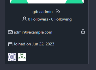 In #26214, we changed each row's display into `flex` which caused this problem. 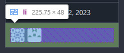  In old version: 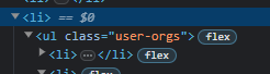 Maybe we can add paddings here?  In old version; 
144 lines
2.4 KiB
CSS
144 lines
2.4 KiB
CSS
.user.profile .ui.card .header {
|
|
display: block;
|
|
font-weight: var(--font-weight-semibold);
|
|
font-size: 1.3rem;
|
|
margin-top: -0.2rem;
|
|
line-height: 1.3rem;
|
|
}
|
|
|
|
.user.profile .ui.card .profile-avatar-name {
|
|
border-top: none;
|
|
text-align: center;
|
|
}
|
|
|
|
.user.profile .ui.card .extra.content {
|
|
padding: 0;
|
|
}
|
|
|
|
.user.profile .ui.card .extra.content > ul {
|
|
margin: 0;
|
|
padding: 0;
|
|
}
|
|
|
|
.user.profile .ui.card .extra.content > ul > li {
|
|
padding: 10px;
|
|
display: flex;
|
|
list-style: none;
|
|
align-items: center;
|
|
gap: 0.25em;
|
|
}
|
|
|
|
.user.profile .ui.card .extra.content > ul > li:not(:last-child) {
|
|
border-bottom: 1px solid var(--color-secondary);
|
|
}
|
|
|
|
.user.profile .ui.card .extra.content > ul > li.follow .ui.button {
|
|
width: 100%;
|
|
}
|
|
|
|
.user.profile .ui.card #profile-avatar {
|
|
padding: 1rem 1rem 0.25rem;
|
|
justify-content: center;
|
|
}
|
|
|
|
.user.profile .ui.card #profile-avatar img {
|
|
max-width: 100%;
|
|
height: auto;
|
|
}
|
|
|
|
@media (max-width: 767.98px) {
|
|
.user.profile .ui.card #profile-avatar img {
|
|
width: 30vw;
|
|
}
|
|
}
|
|
|
|
@media (max-width: 767.98px) {
|
|
.user.profile .ui.card {
|
|
width: 100%;
|
|
}
|
|
}
|
|
|
|
.user.profile #loading-heatmap {
|
|
margin-bottom: 1em;
|
|
}
|
|
|
|
.user.profile .ui.secondary.stackable.pointing.menu {
|
|
flex-wrap: wrap;
|
|
}
|
|
|
|
.user.followers .header.name {
|
|
font-size: 20px;
|
|
line-height: 24px;
|
|
vertical-align: middle;
|
|
}
|
|
|
|
.user.followers .follow .ui.button {
|
|
padding: 8px 15px;
|
|
}
|
|
|
|
.user.link-account:not(.icon) {
|
|
padding-top: 15px;
|
|
padding-bottom: 5px;
|
|
}
|
|
|
|
.user.settings .iconFloat {
|
|
float: left;
|
|
}
|
|
|
|
.user-orgs {
|
|
display: flex;
|
|
flex-flow: row wrap;
|
|
padding: 0;
|
|
margin: -3px !important;
|
|
}
|
|
|
|
.user-orgs > li {
|
|
display: flex;
|
|
border-bottom: 0 !important;
|
|
padding: 3px !important;
|
|
max-width: 60px;
|
|
}
|
|
|
|
.user-badges {
|
|
display: grid;
|
|
grid-template-columns: repeat(auto-fill, 64px);
|
|
gap: 2px;
|
|
}
|
|
|
|
.user-badges img {
|
|
object-fit: contain;
|
|
}
|
|
|
|
#readme_profile {
|
|
padding: 1em 2em;
|
|
border-radius: 0.28571429rem;
|
|
background: var(--color-card);
|
|
border: 1px solid var(--color-secondary);
|
|
}
|
|
|
|
#notification_table {
|
|
background: var(--color-box-body);
|
|
border: 1px solid var(--color-secondary);
|
|
border-radius: var(--border-radius);
|
|
}
|
|
|
|
.notifications-item:hover {
|
|
background: var(--color-hover);
|
|
}
|
|
|
|
.notifications-buttons {
|
|
display: none;
|
|
min-width: 74px;
|
|
}
|
|
|
|
.notifications-updated {
|
|
display: flex;
|
|
}
|
|
|
|
.notifications-item:hover .notifications-buttons {
|
|
display: flex;
|
|
}
|
|
|
|
.notifications-item:hover .notifications-updated {
|
|
display: none;
|
|
}
|